
Concept Development
Strong visuals can connect with an audience faster, and with more emotion than words alone. Developing compelling visual concepts is a team sport, it takes focus and agreement on what we are trying to accomplish, the main message, supporting facts, and knowledge of current economic and competitive forces. And if the campaign is global, like this sample, there will certainly be regional and local considerations to factor.
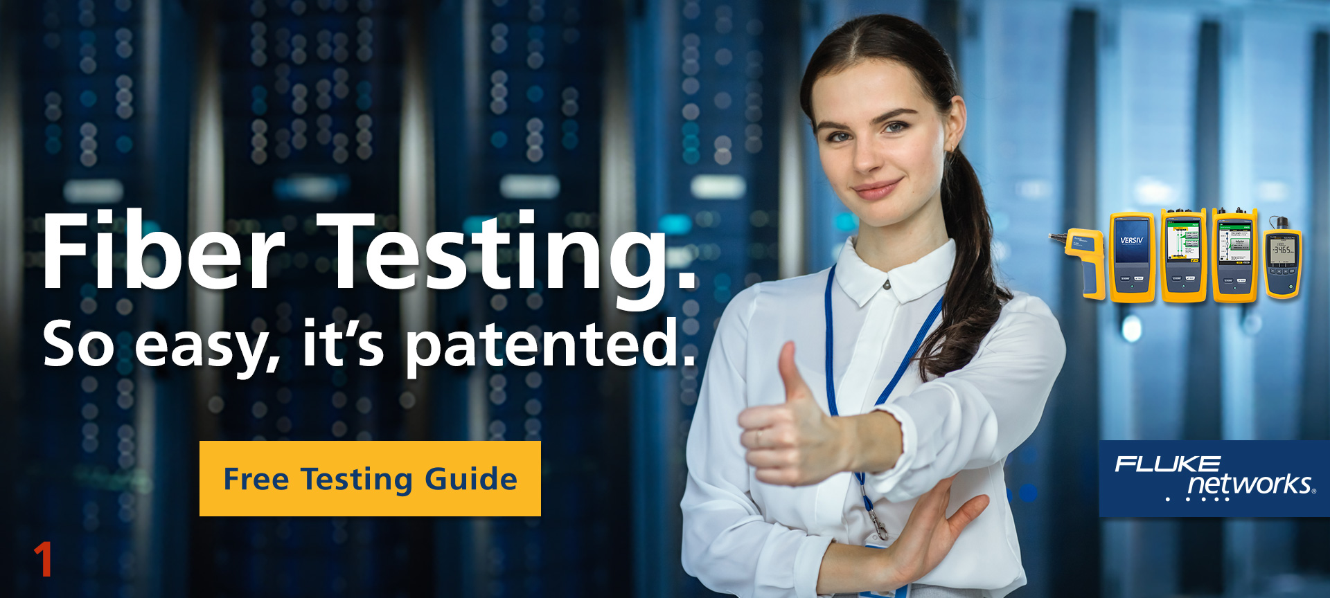
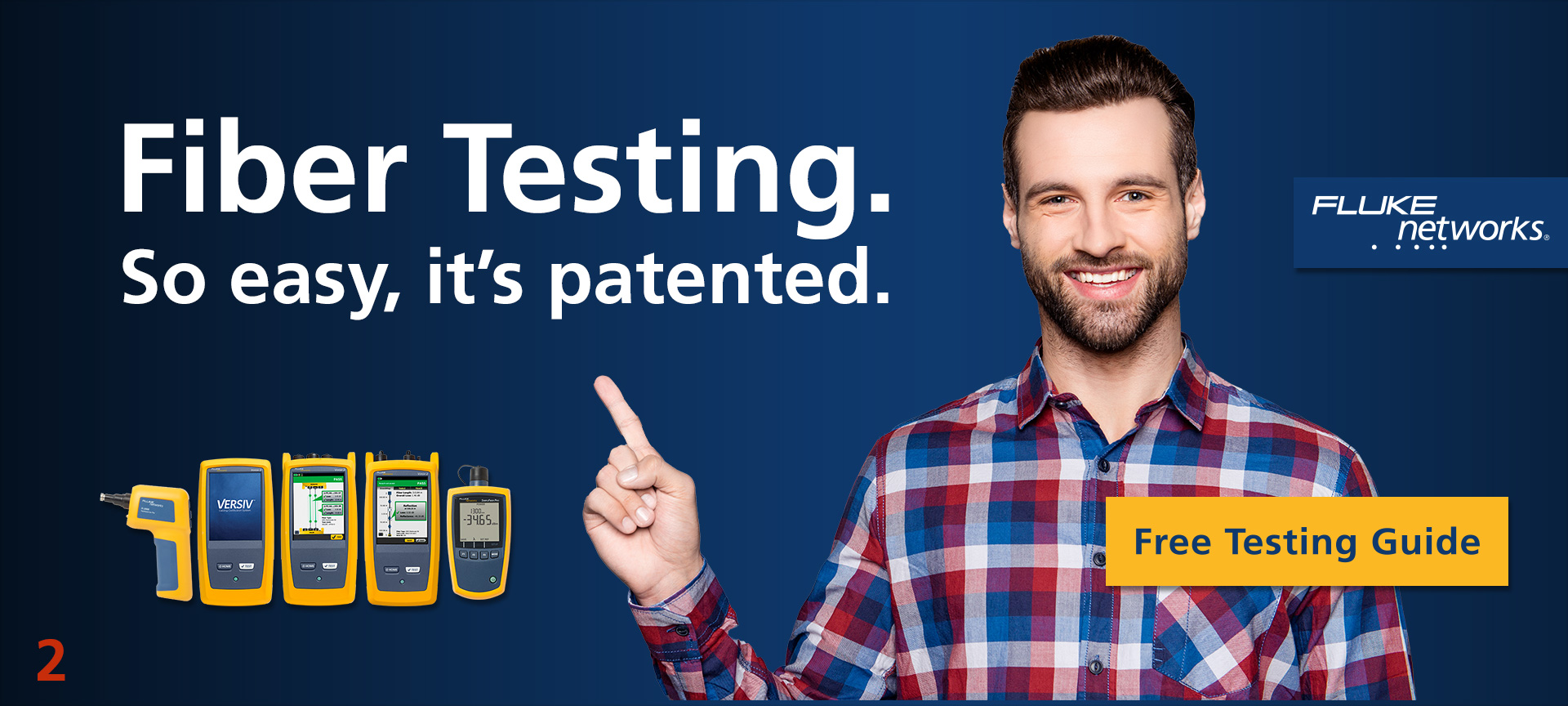
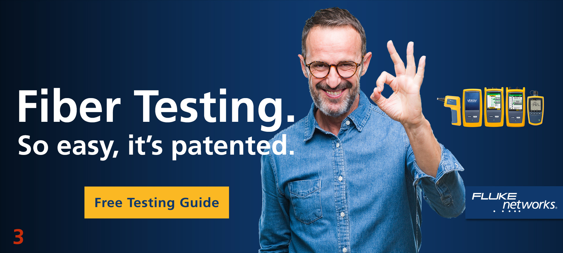
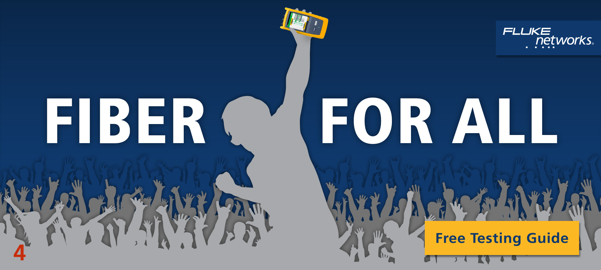
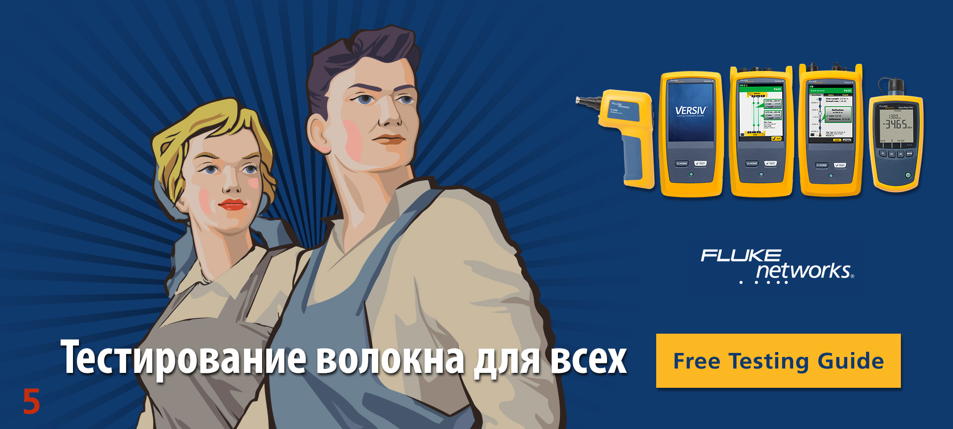
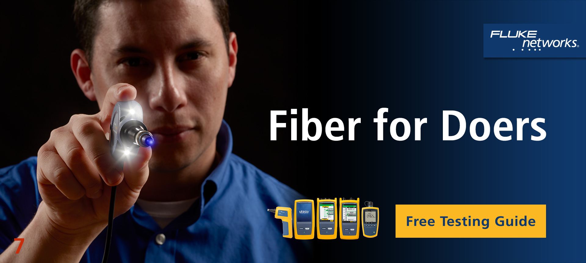
The concept development samples shown here were created for a campaign to increase sales of Fluke Networks brand fiber optic cable test and certification instruments. The brand had already achieved a high level of sales saturation among known customers, so the focus was to add net new high value leads to the database.
- Primary audience: Private network and data center owners
- Secondary audience: Datacom cable installers
- Objective: Take the next step—consume the asset
- Key message: Fluke Networks brand instruments make
efficient fiber testing possible for everyone
The campaign brief collected this information along with supporting messages and key facts that directly inspired the concept development you see displayed here. Since the primary approach to cultivate new leads is pay per click (PPC) banners, we developed copy and concepts to work in a small space first.
Mark Mullins: marketing direction and copy
Phil McCoy: creative direction and copy
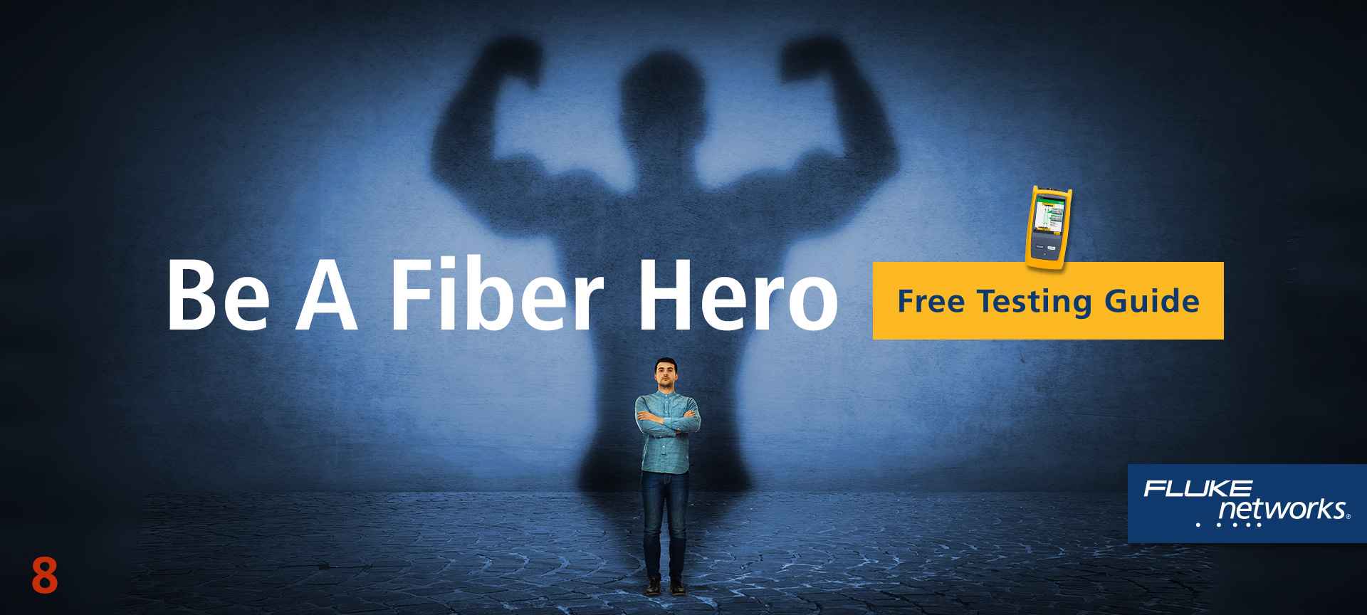
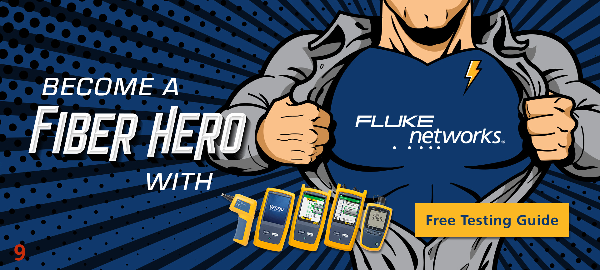
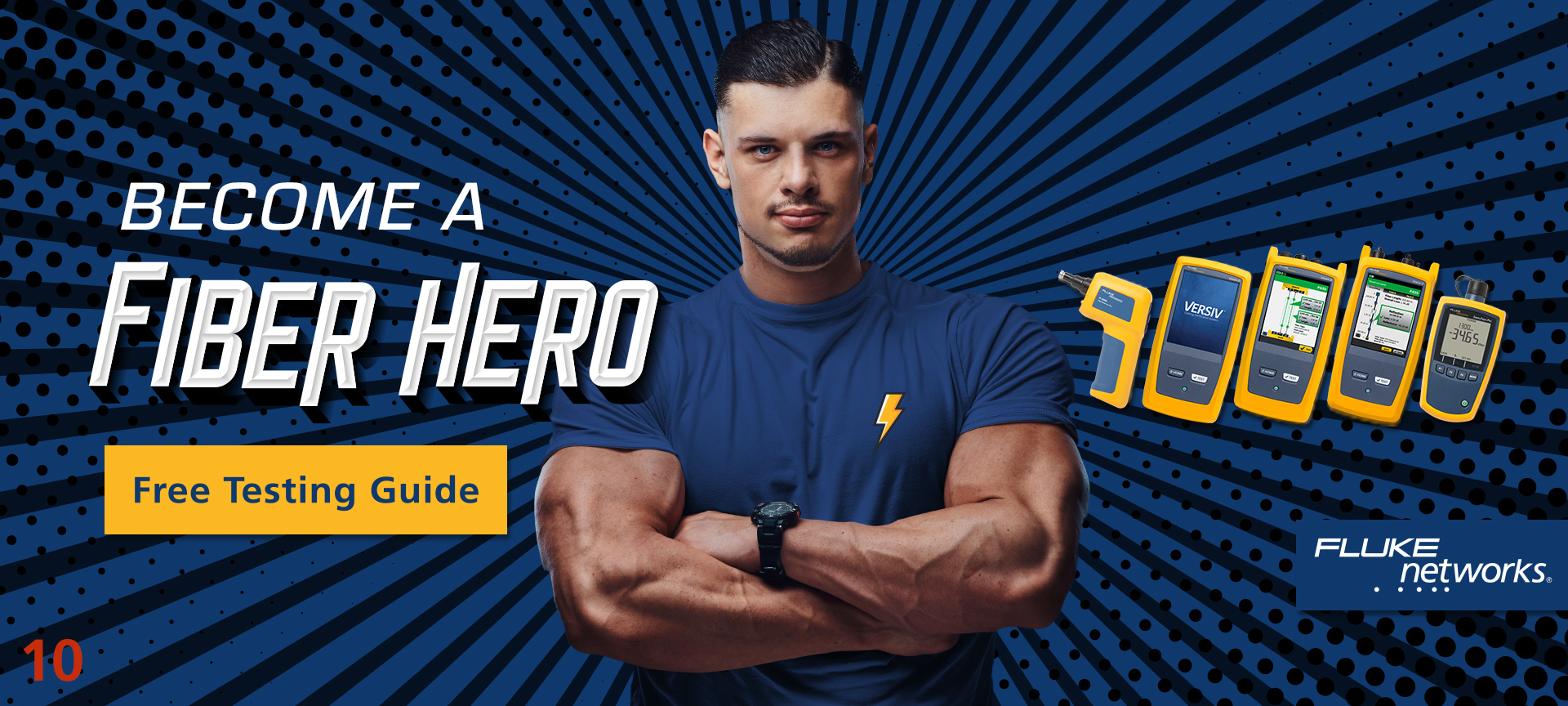
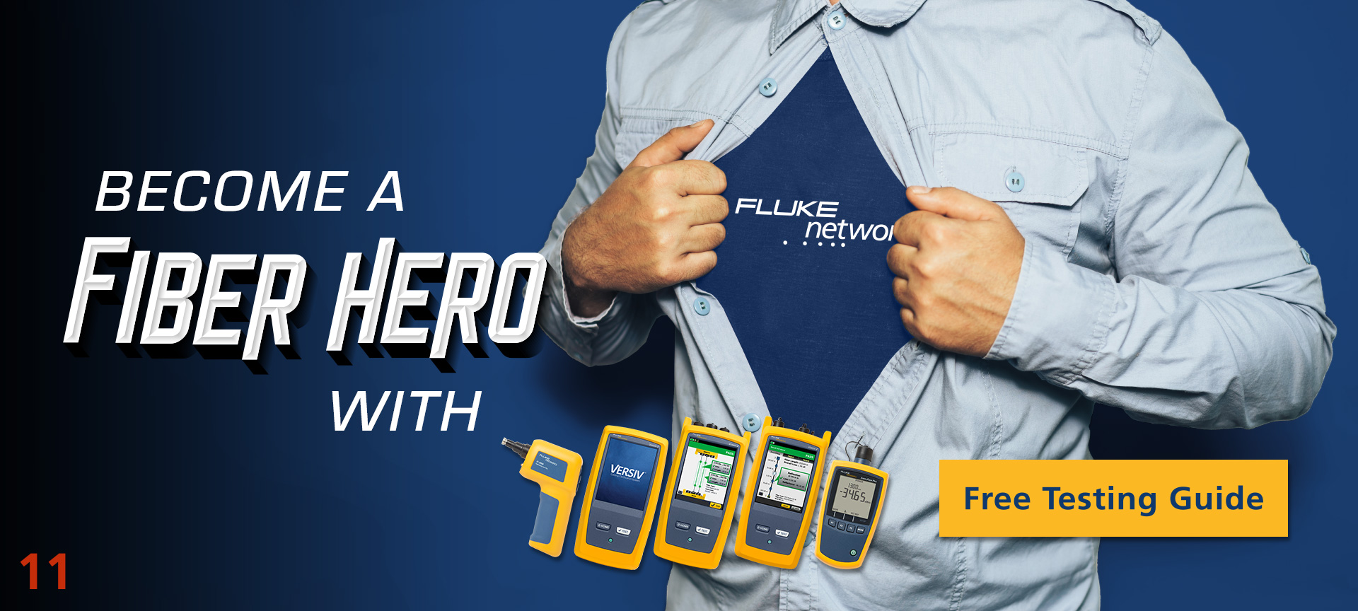
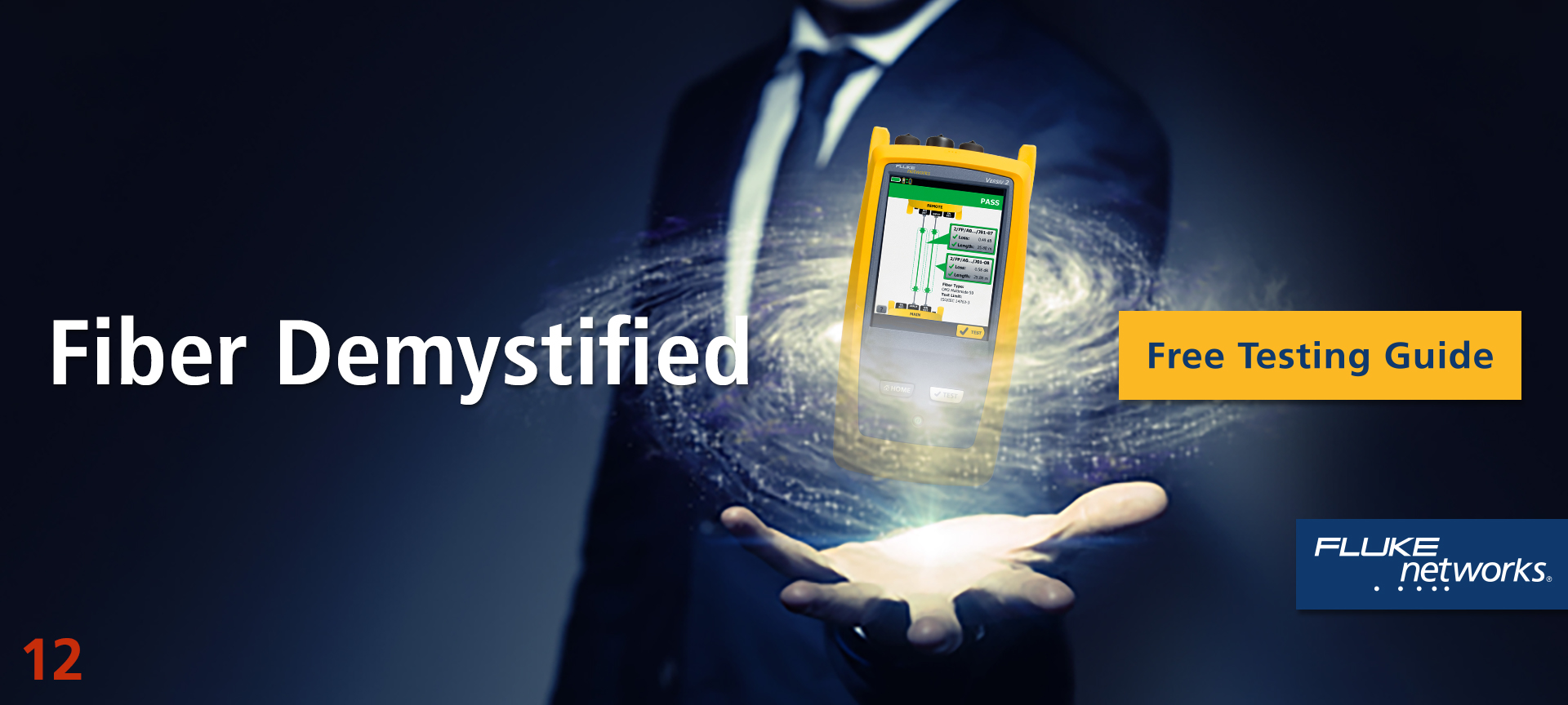
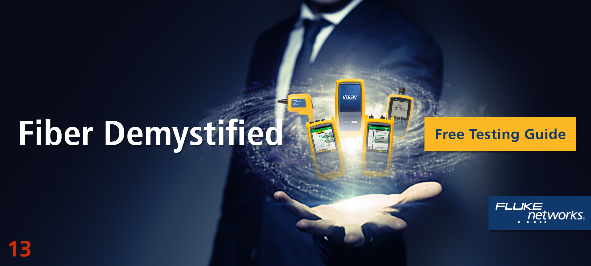
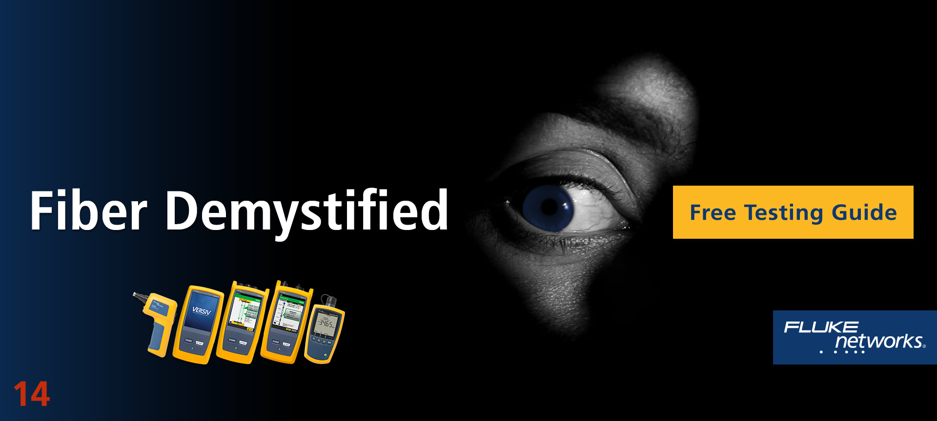
Once we had creative brief approval from marketing leadership, I developed a large number of options, many of which are displayed on this page. The work was presented to marketing leadership for feedback and narrowing to a handful for testing. The clear winner was concept 3, however there were concerns about the copy and model selection working globally. We addressed these concerns by switching to an Asian model for Asia and changed the copy to “Fiber Testing. Clearly Simplified.” in some regions. Concept 13 was the second favorite with a concern that “demystified” was a tough word to translate. We decided to change the headline for translation purposes to “Take the mystery out of fiber testing.” And bringing up the rear was concept 4, the rock star.
The team selected three ad sizes (300×600, 728×90, 300×250) and ran tests of the three concepts. Concept 4 surprised me by getting the best aggregate click-through rate on all three banner sizes. So we built out the campaign with concept 4 and ran with it.
The results of the campaign were spectacular out of the gate generating twice the number of sales leads over the same period from the previous year.
Note: All of this concept development was completed in a very lean, budget conscious fashion. I used one hundred percent stock photography and art elements that I customized to make brand coherent. We did not have time or budget for custom photography or illustration.
